
A long overdue redesign of the Battle.net shop was finally prioritized. I was responsible for the UX redesign, overall visual redesign, transition implementation strategy and production strategy.
Project Drivers
Extremely engineering dependent – no modularity or reusability, pages were manually duplicated and modified by shop engineers
Separate Desktop & Mobile sites, requiring duplicate work for every product launch
Rigid design limited product on-page media
Newer, more complex business models further jammed already complicated publishing tools
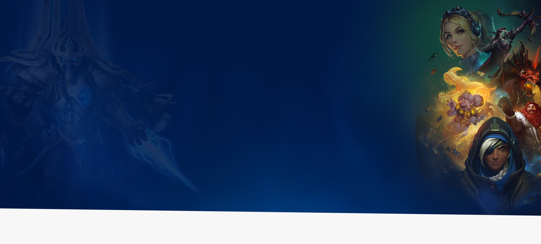
Original Shop StarCraft Family Page
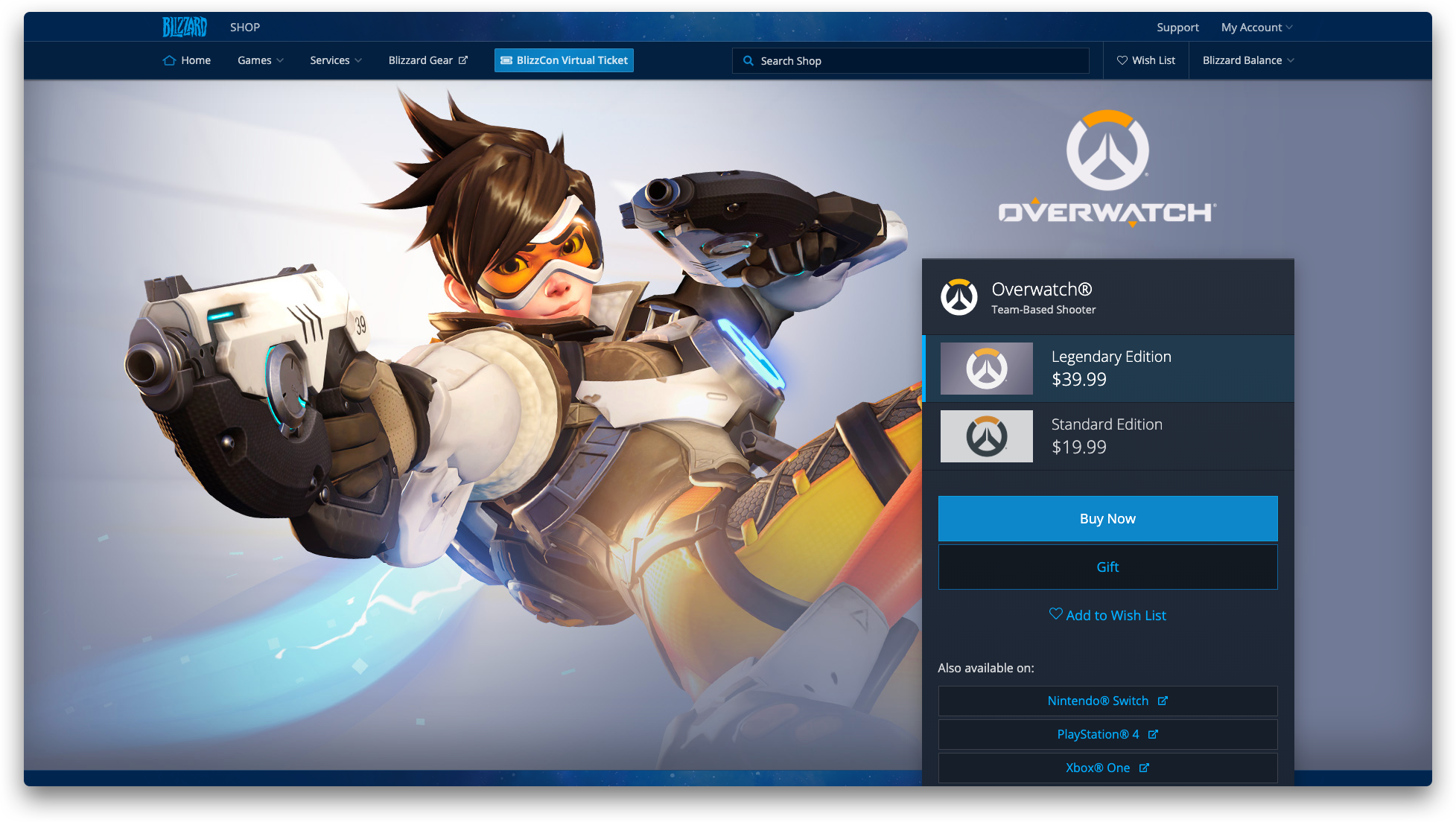
Original Shop Overwatch Product Page
Establish a modular front end interface that can accommodate the range of business models and products sold currently and in the near future on the Battle.net Shop
Drastically reduce engineering setup and maintenance costs
Eliminate the need to support a dedicated mobile site/view
Support Game Team interest in common ecommerce features: ex. additional product images, full screen video
Business Requirements
New features would not be in scope, however minor additions to existing features could be included
Legal required relevant purchase information to be in close proximity with purchase details and buy buttons
New formatting and styling should be identifiable as a Blizzard product, but allow for upcoming partner products
The shop must continue to seamlessly function embedded within Blizzard’s Battle.net Game Launcher
Competitive Landscape
Most similar games ecommerce platforms already contained the functionality being requested by our game marketing teams, however lacked the level of polish Blizzard is known for
Sketches
All design work begins with pencil and paper, or these days Apple Pencil & iPad. Although wireframing and prototyping tools today are fast and fluid, I find it important to eliminate the urge to start aligning boxes to a grid and start filling with text and placeholder graphics.
Wireframes & Prototype
I took variations of feature sketches and turned them into wireframe and then lightly interactive prototypes in Axure to get user feedback.

High Fidelity Mock-ups
From wirefames, I render high fidelity mockups of each layout to explore composition and information hierarchy in context. Art created by incredible Blizzard artists should be the centerpiece of any Blizzard product, the following are some variations in balancing imagery and information we tested along the way towards the final design:
Redesigning the front end of the shop while being limited from changing core functionality introduced some interesting design parameters to work with. Here are a few considerations and the resulting feature design:
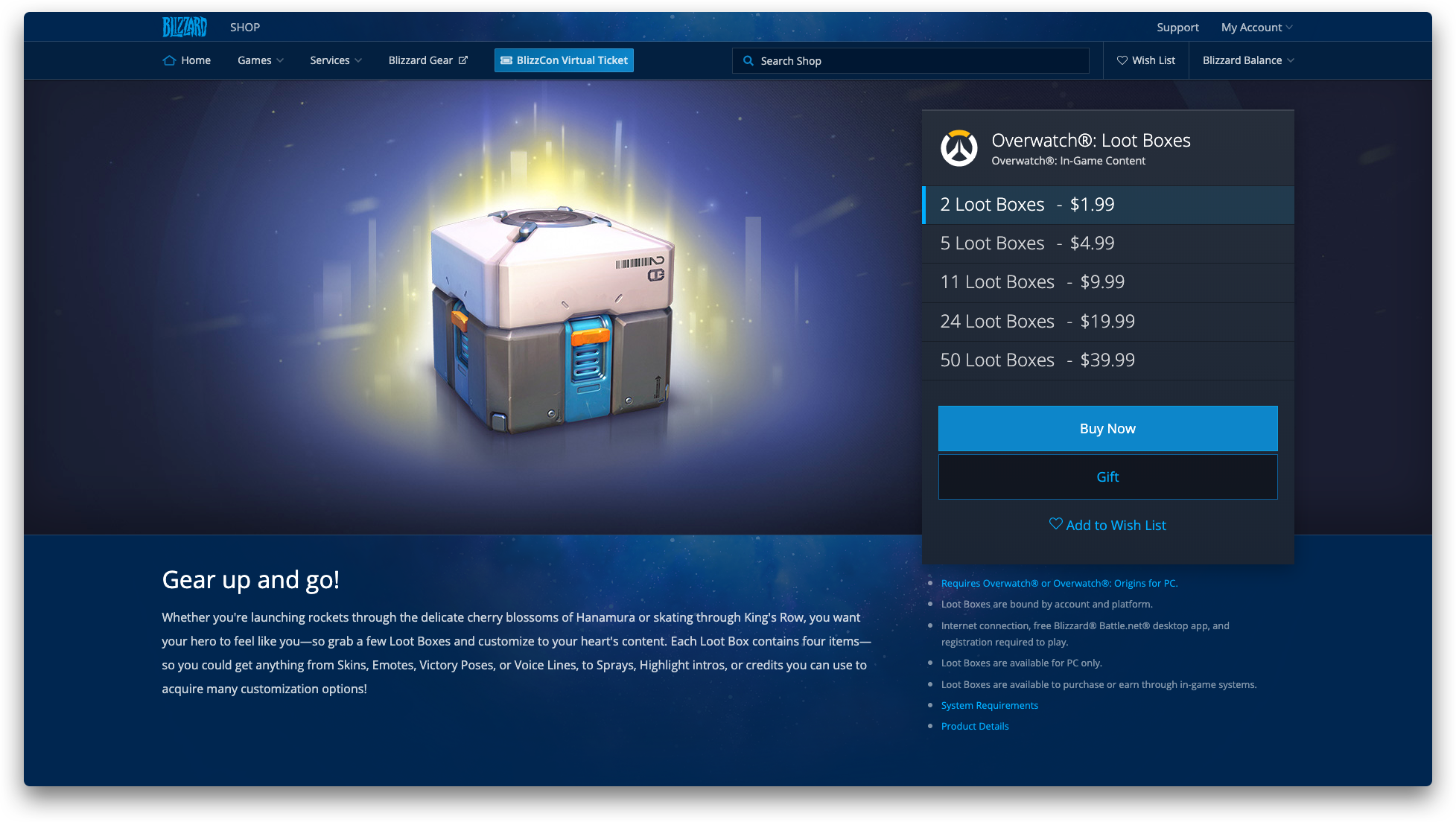
Blizzard products can be sold and subscribed to in a range of ways, depending on product type and franchise business model.
In the previous design, this variability often bloated the page and added visual noise. A new solution needed to cleanly define a separation between the background art and prioritize the readability of purchase information.
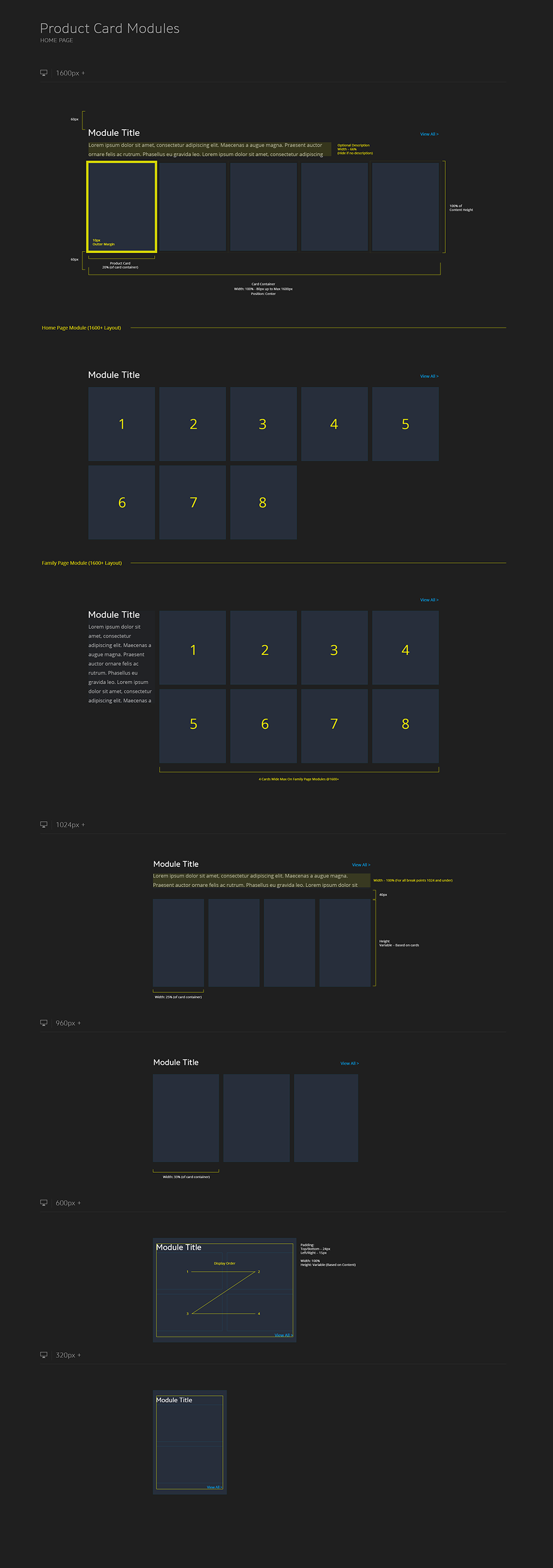
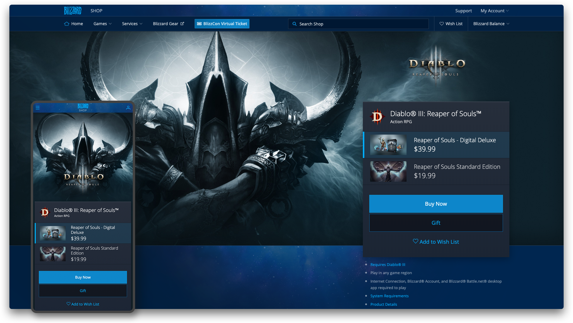
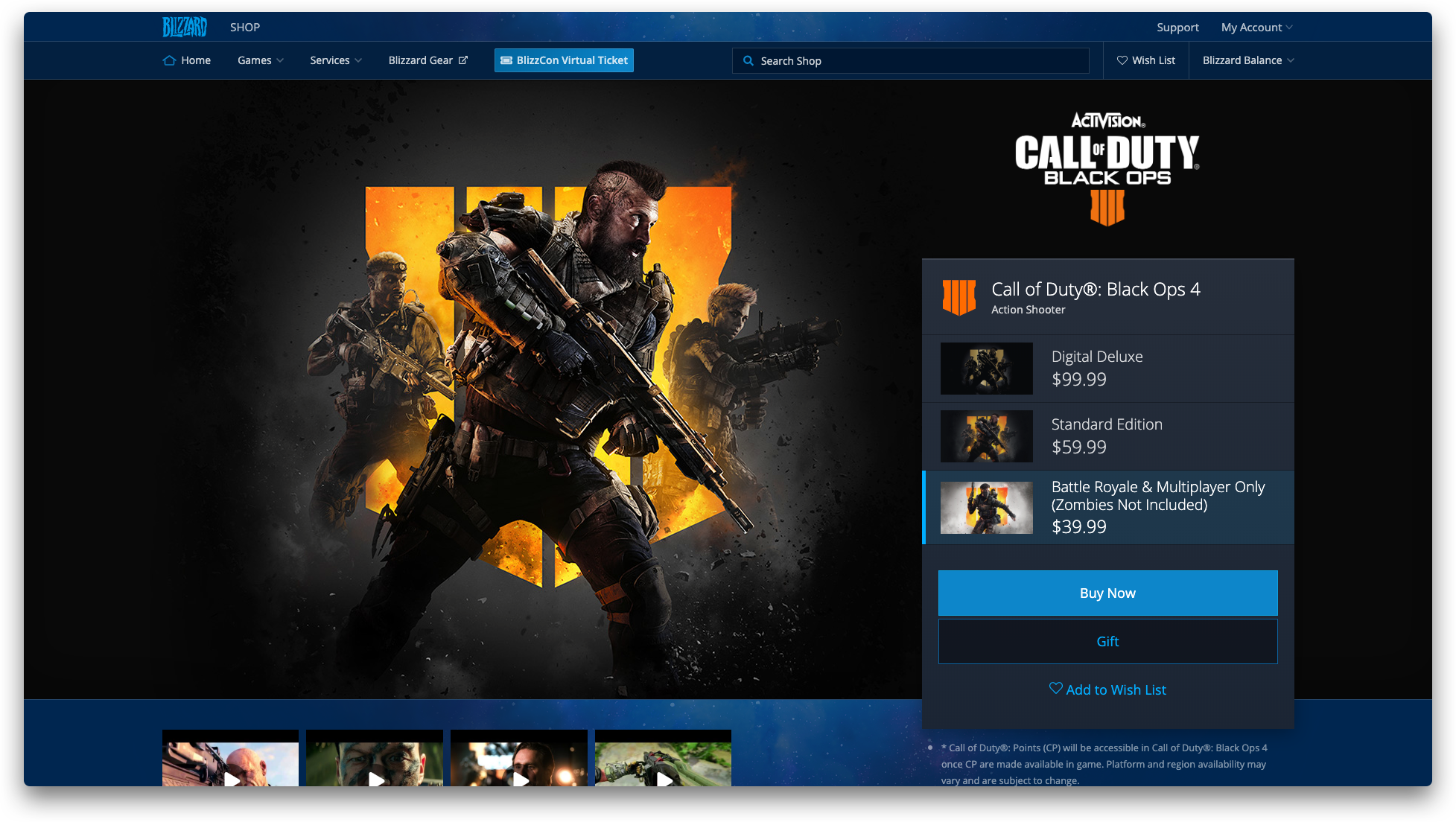
Resulting Design – Establish a flexible, modular layout that can cleanly display any combination of purchase options to the customer

In order to accommodate an anchored purchase block that can shrink or grow depending on purchase options, the product content area is anchored to the bottom of the purchase block and cleverly repositions itself up or down depending on its length. The backgrounds are designed to fill this space so complex products (often box products) receive extra screen screen space to show off key art.
Resulting Design – Full Screen images designed to overflow and fill empty space on complex products

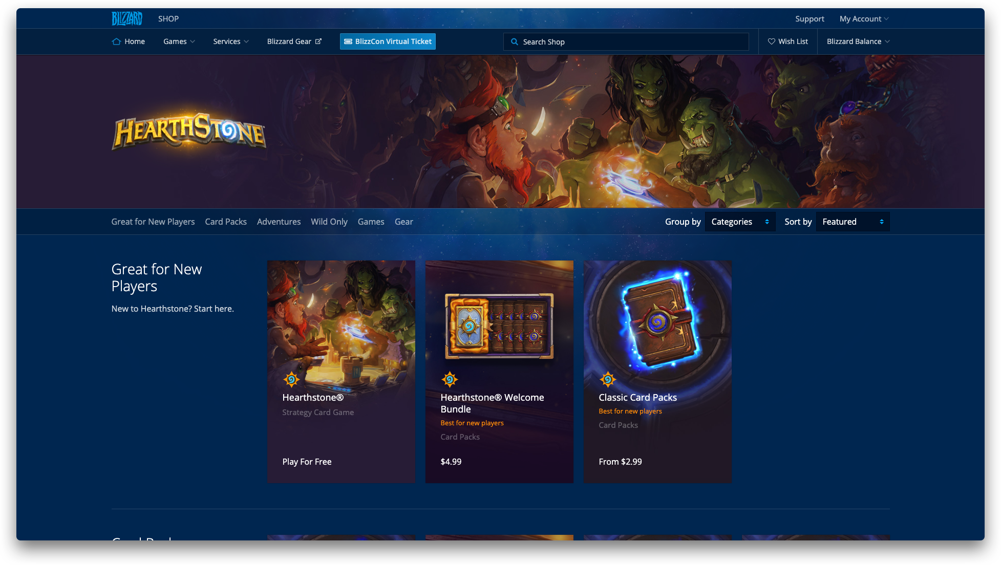
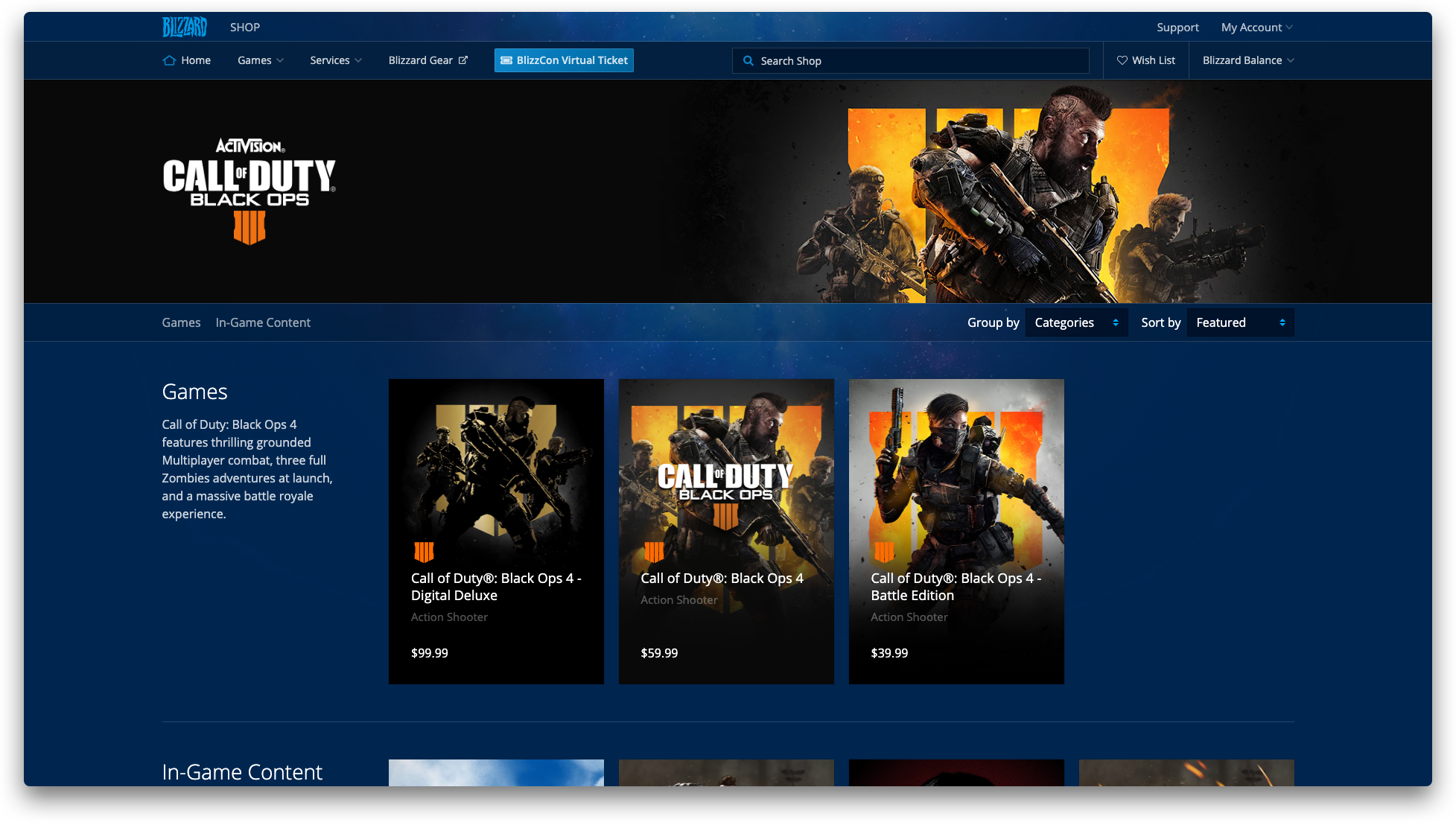
Prior to the redesign, the ability to organize products was limited to a designation between a ‘game’ or an ‘add-on’. For example, this meant there was no way to filter the over 40 World of Warcraft add-on products when viewing the WoW product family page, other than latest posted.
Resulting Design – I developed a tag-based product relationship matrix allowing our producers to group, organize and order game and in-game content based on categories and relationships to like-products.
This also created the opportunity to add in a contextual descriptions about each category to better educate customers about product usage before purchase

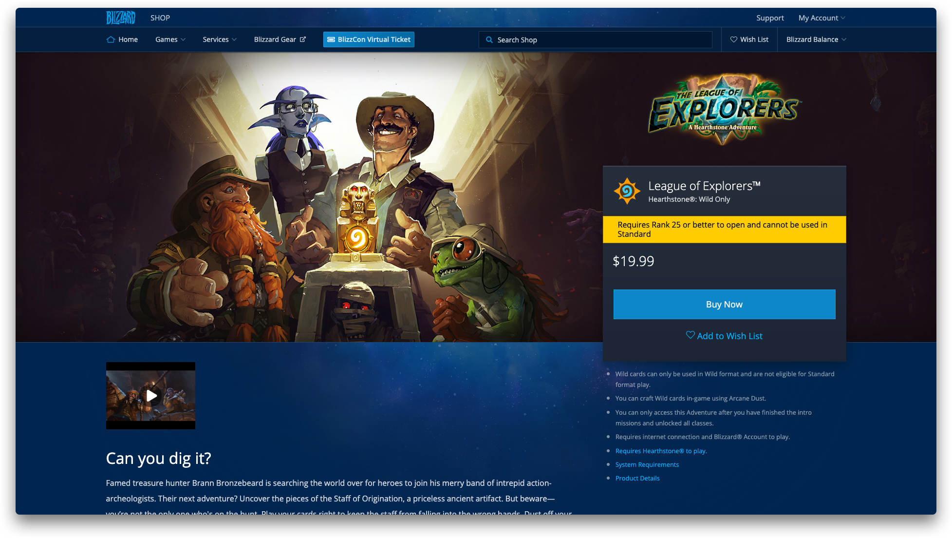
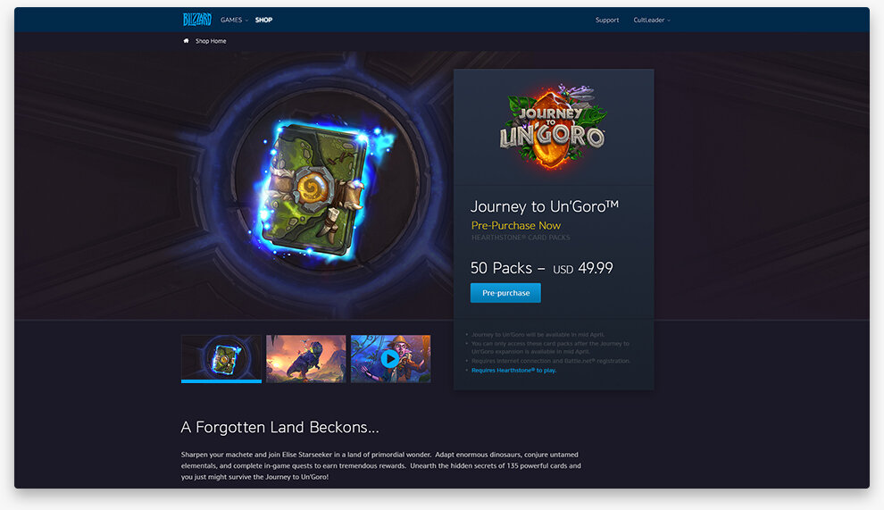
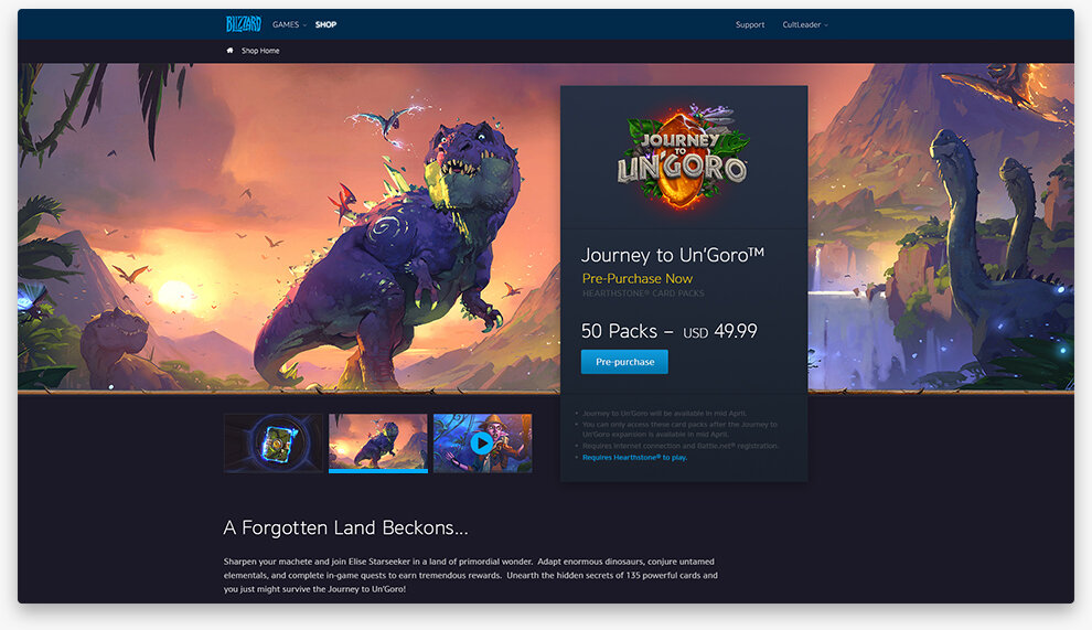
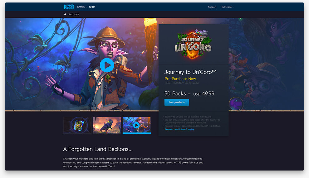
Even though Blizzard’s products are basically made of magic, the existing shop limited representation of the product to a background image with overlapping text.
Resulting Design – Make the full screen media carousel instead of tacking on a standard image gallery
Once the designs were user validated and approved by design and engineering stakeholders, I converted the high fidelity mocks into a series of components and defined the intended functionality in pixel-perfect redline docs. These components eventually made their way into a Battle.net wide design system as multiple design orgs within the company combined to better service engineering needs.
This project is still live as January 2020 and can be found here at shop.blizzard.com